Your seasonal family
See the season that best matches the visible combination of temperature, depth and contrast in your selfie.
Endam's AI color analysis app uses a selfie to suggest your seasonal color type, build a personal palette and explain how to use those colors in real outfits.
Discover your palette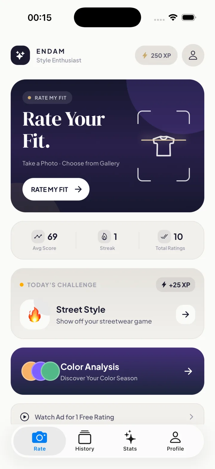
Color analysis should make dressing easier, not give you another rigid rulebook. Endam turns the result into clear choices for clothes and accessories.
See the season that best matches the visible combination of temperature, depth and contrast in your selfie.
Explore wearable shades that are likely to sit naturally beside your coloring and support your overall look.
Learn which shades may overpower or flatten your coloring—and how to keep wearing favorites more intentionally.
Find practical neutrals for coats, trousers, bags and shoes so your palette works beyond statement colors.
Use your palette to build low-effort combinations instead of evaluating every color from scratch.
Follow color analysis with an outfit rating to see how the full combination works together.
Camera processing, colored light and nearby objects can change how skin, hair and eyes appear. A clean photo gives the analysis a better starting point.
Stand near a window during the day, but avoid a bright beam of direct sun. Turn off strongly warm or cool room lights so the camera sees more neutral color.
Remove beauty filters and strong color grading. If practical, use minimal makeup and move brightly colored objects away from your face. A plain gray, beige or off-white background is helpful.
Keep your face visible and in focus. Avoid sunglasses, heavy shadows and backlighting. Your natural hair color can provide useful context; if your hair is dyed, remember that the result may reflect its visible color.
Personal color analysis is a styling framework, not a scientific diagnosis. Use the palette to notice patterns, then keep the shades that make you feel most like yourself. For outfit-level choices, read our color matching guide.
Most seasonal systems organize colors through a combination of these visible qualities.
Whether yellow/golden or blue/pink qualities feel more harmonious.
Whether lighter tints or darker shades create a more balanced relationship.
Whether saturated colors or softer, grayer colors are easier to wear.